Couldn’t have worded it better myself

Ran out of chicken? It’s unheard of right… especially when you’re fried chicken basically dominates the world. Yes, I do mean KFC. And thats exactly what happened for a long 7 days in hundreds of KFC joints in the UK.

With fans of the franchise deeply affected by not getting their greasy hit, some took measures into their own hands, vocally voicing their opinions on social media and even contacting the police, for them to say “the #KFCcrisis is not our matter”.

But the response to this public outrage was so simple yet so good. Featured on a full page print-ad in The Sun and Metro, agency Mother London attempted to turn the problem on its head. All that was needed was a little rearranging of the letters and alas. An apology was crafted with the new name to read ‘FCK’, followed by a sub heading ‘We’re Sorry’ and a paragraph addressing the situation. The agency declined to comment on the ad, as it speaks for itself. Timely and fantastic.

Screen Shot 2018-02-24 at 8.18.59 pm


Pitching, problems and practice

Throughout the course of advertising, the pitching paradigm has become almost second nature to clients and agencies. While its generally considered an integral part of winning new business, it’s hard to ignore the extreme preparation, man hours and cash that goes on behind the scenes, often to stand in front of a panel and have your master game plan binned, or accepted (which is often unlikely). According to the AAR, even of the work that wins pitches, a whole 56% of it is discarded. Surprising? Maybe not. Therefore, should we be asking the question; has pitching gotten out of hand? And, are there better ways to manage a pitch?

Let’s start with the immense time and effort put towards the build-up to a pitch, which usually occurs for 1-2 months. It’s no wonder the agency talent isn’t entirely burnt out by the end, hindering their power to continuously be creative even if they won… as by that stage, they probably hate the account their gunning for and feel demotivated. An article posted by MindEcology seems to support this idea, stating that “Burned out people work slower than their enthusiastic counterparts and eventually, they have a way of taking off and causing agencies to scramble and burn up time trying to replace them.” The underlying fact is that agencies are working a silly amount of unbillable hours stimulating their brains and energy, more than likely towards an unprofitable outcome. In a report posted by Campaign, the top 50 Advertising agencies spend up to 7.5 million euros per year on pitching. It seems crazy, but if you’re involved in this incredibly competitive industry, that’s probably normal. A possible solution to this might be, having a strict limit to the amount spent on a pitch. For example, efforts must not exceed $20,000. This would allow more time to work on existing accounts and wouldn’t drain agencies out as much, financially and emotionally.

Richard Morris, the business Development Director at DDB London, offers his opinion on cutting down time and investment, with this alternative. “Why not limit how long we all spend on any particular pitch; let’s do it really intensively in a week rather than thrash around for a month. With less time to fanny about, we’re bound to spend less physically. If management did nothing else for a week, clients would actually get a lot more of their time, and just think of the saving on salary costs.”

When it comes to ideas, how do you choose the best one if the work is subjective? That’s another issue that agencies face. Like the old saying, “one man’s trash is another man’s treasure”. Often ideas are preciously crafted, admired and protected, and agencies are basically handing them out with no price tag. That’s a bunch of free thinking, and who’s not to say one witness on the panel isn’t planning to head for the hills with that cracking idea, and come back a millionaire? And while no human wants to be the bearer of bad news, there’s generally a shortlist of just four, someone’s got to lose, and no one likes to feel their ideas are worthless. I can’t help but think, have we unintentionally placed a lesser value in the work of humans?

Constantly immersed in this industry, we are somewhat receptive to popular agencies collecting more awards, based on factors such as; reputation, media coverage, successful track record and so on. Agencies that fall more under the radar, may have to strive harder to get that signature, contract, or funding their looking for. If an agency is unlucky enough to receive the late afternoon slot, it’s vital to hold attention, as its likely the judging team have dinner and Netflix on their mind, not as switched on as they were at 8am that morning. With that in mind, making a lasting impression is crucial. Humans tend to respond to a great story, therefore if you want to cause action, your pitch needs to tell one. This is a chance for the pitching team to get extra creative, considering room ambience, props, costumes, music or food and beverage for instance.

In seeking third party guidance, intermediaries play a role in helping steer agencies so they grow and evolve, as well as advising decisions. TrinityP3 is one example of an intermediary that strives to help clients achieve commercial purpose through creative processes, in turn improving their marketing output.

Agencies should be cautious and particular about who and what they’re pitching for, and also who they’re up against. Agencies, when pitching, have been described as “doctors operating in the dark, hardly knowing who the patient is. They barely know the organization or how they work, or what they’re like behind closed doors”. Therefore, before agreeing to participate in a pitch, it’s of critical importance that an agency queries if they have any chemistry with the client or can see a future business relationship, and i’m talking years, not just a summer fling. On the other side of the spectrum, clients need to be rigorous in what their asking for. In most pitches, there is an unnecessary level of secrecy, however it’s important to be transparent, have respect, bravery, timing down packed, have good access and navigation. So, it seems sensible that from the get go, the agency bombards the potential client with questions, to get down to the very nitty gritty details of what will give them the best shot at winning. Additionally, finding out who the decision makers are because essentially, they will make or break.

Another challenge area for agencies is when dissecting the brief, who makes up the pitch team. A set of fresh minds that have minimal knowledge of the client’s brand, or experts in a certain field? If you ask Erik Saelens, Founder and Executive Strategic Director of Belgium’s Brandhome group, he believes pitching is all a bullsh*t illusion reflecting false reality. He backs his firm opinion up with ten reasons, and his company has shamelessly “ditched the pitch”.

For or against, pitches are here to stay. Although they won’t paint a picture of the promised land, at the end of the day, agencies will do whatever it takes to win more business, and in a highly competitive industry, we’re all here for one thing: the money.

From Mailboy to Millionaire *billionaire

Australian advertising history is filled with pioneers who brought a distinctive style to the table, and undoubtedly has produced a fair share of legends. The name John Singleton may ring a bell…whether good, bad or controversial; there’s no denying that ‘Singo’ has had notable presence on Australian turf in the Advertising arena.

In his early days, the young Fort Street High Graduate landed himself a ‘dispatch boy’ job in the Sydney office of J. Walter Thompson. He then went on to pursue a Copywriting role at Berry Currie Advertising, before moving up the ranks to become Creative Director in 1963. At 25, with a wealth of industry knowledge and skill, John co-founded the provocatively named ‘SPASM’ agency in 1968, where his entrepreneurial character and anti-authoritarian attitude would be on full display.

Their clients were mainly local Sydney retailers and rather than using polished voices, their ads were distinct as they embraced the tone of the average working-class man. On the other hand, were associated with being crass, vulgar and offensive to anyone who was not a footy lover, boozy, “try blu” Aussie bloke.

The agency flourished for five years, until an offer in 1973 from New York agency Doyle Dane Bernbach was too good to turn down. Singleton and his affiliates sold their agency to DDB for $1.2 million and for some time, he was Managing Director of Australian Operations in their company.

Singo’s campaigns broke new ground with their creativity yet highly idiosyncratic retail advertising, with catchphrases that lingered in one’s mind; one of his most successful was for ‘David Holdings Wholesale and Liquor’ in 1974. At the core of the campaign was value for money and Singleton’s approach was to shout the prices at viewers with a voiceover saying “Where do you get it?”, and repeat. Another is evident for ‘Hudson’s Timber and Hardware’, in which he cast a toothless old handyman to say “udsons with an aitch”.

Defending ocker advertisements from the critics, with people often claiming “a bad example was being set for school children and the face of Australia”,  ‘Advertising News’ argued that it was an important part of Australia’s coming of age. Saying “We can’t see why the broad Australian accent and colloquialisms should take all the critisism they do … Ockerism is a manifestation of Australia growing up. It is our own language and not imported. It would be a pity if our 1976 culture couldn’t take it in its stride.”.

Amidst a clash of cultures and working for a giant with owners abroad, an unhappy Singleton left his role under DDB after five years. This triggered him to stay out of advertising for a while, 9 years to be precise. During this time he tried his hands in other fields such as radio and television broadcasting, promoting rodeo’s, breeding racehorses, lingerie, property investing and even owned a circus… John of all trades?

Singo returned to advertising with his next venture in 1985; creating his absolute own ‘John Singleton Advertising’. The growth of this agency was phenomenal, later absorbing 50 other companies. The ad business produced a succession of campaigns, including the popular ‘Qantas – I still call Australia home’ initial campaign. JSA’s image was a direct replica of himself, literally his character and charisma as a brand… everything ocker, hard-working and fiercely Australian.

Having developed close ties with the Labor party, Singo had an impact on political advertising and was the no.1 candidate for the 1987 election, his firm coming up with the catchy jingle “Lets stick together, lets see it through” which urged Australians to keep holding on to the Australian dream, while reminding them that “Nobody ever got anywhere changing horses in mid-stream”.

The roaring 1980’s provided the perfect platform for Singleton’s creative powers to flourish and conservatism was flipped upside down. The 80’s painted a time when the Australian society were searching for an identity. Multinational agencies were making their existence felt with the dawn of strategic planning and imitated a British or American tone of voice, whereas Singleton’s style stood out from the crowd.

In 1977, JSA emerged with a trouble Ogilvy and Mather to create ‘Singleton Ogilvy and Mather’ and with the help of his right-hand man Russell Tate, managed to turn the business around. Four years later, they had acquired an impressive 49% of agency JWT to manage a $60 million dollar deal and Singo’s era with Ogilvy and Mather remained until 2009!

Aside from advertising, Singo has also built a reputation around drinking, arguing and womanizing, with more than a few not-so-secret sides of his personal life revealed…and when you’re under the spotlight, there’s no hiding from the paps or slipping under the radar. Take this incident that made news headlines; “Singo lunges at life-long friend with broken wine glass”. That was the end of Monday lunch and he copped a $550 fine from the cops, not that it would break his bank, the same year he sold his Killcare beach house for 4.25 million so he has the funds!

Well known for his larriken demeanor in Australia and love for a “good ol time”, often involving drinks and more drinks… he shouted the entire Rosehill racecourse after his horse won the golden slipper. And lastly; Margaret, Maggie, Liz, Julie, Belinda and Jennifer, the six wives of his past has generated much more banter about his character.

All in all, Singo is a guru who has had significant impact in shaping Australian Advertising and its culture since the nineteenth century; the first to use ‘ocker’ style, revel in vernacular and talk to consumers the way he talked to his mates. His relentless energy saw him dream large through his advertising and divide the industry. If “Australianised” was a word, he would take that cake.


Depop Spec Ad

kYEqHQUC_400x400

I’ve never been a fashion queen myself but that didn’t stop me from raising my hand for the ‘Stylist’ position for our recent ‘Spec Ad’ College Assessment. Despite the title having a nice ring to it, I felt this role would suit me as I have a decent eye for detail and styling others seemed a fun task to do. The majority of our class including myself had never heard of ‘Depop’, but after breaking down the concept and brand purpose, recognised how it could be brought to life.

The week leading up to the production was quite chaotic, with ideas and feedback communicated back and forth on our Facebook page as well as offline, and given the small time frame we had to organise, everything had to happen fast. I tend to procrastinate on the regular, so this wasn’t such a bad thing as it physically made me get a move on. Also being a “team project” influenced my attitude towards input, I was not planning to let anyone down!

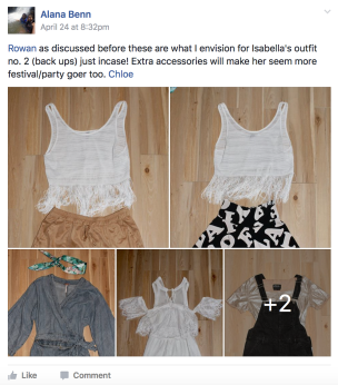
Upon receiving the pre-production booklet outlining the talent, costume, look and feel (highly relevant to me), I began pulling together options for five different looks. I gathered some visual inspiration from Pinterest and magazine style edits, but spent more time scouting my house for items I felt I had. After creating numerous outfits, I took pictures and ran ideas by the Art Director and Creative Director for their opinions. We made final decisions on what the talent would wear prior, however I brought alternatives on the day of the shoot to be safe. I imagine real Stylists on Hollywood sets would turn up with five suitcases stuffed to the brim.

Screen Shot 2017-05-02 at 12.30.48 amScreen Shot 2017-05-02 at 12.31.23 am

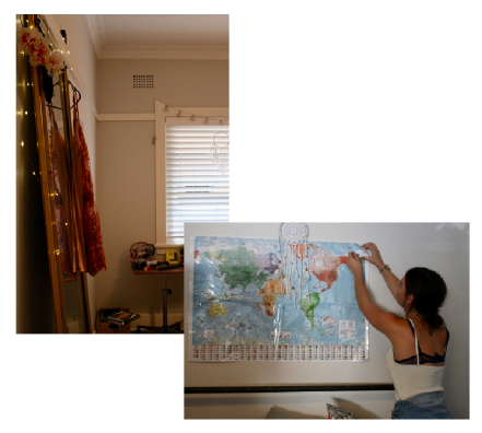
Arriving at the location felt slightly daunting but I was genuinely excited. I began inspecting the rooms along with members of the Art Dept., moving pieces around and crafting the mise en scene. This process involved critique from others as we all worked together to bring the vision alive. When arranging both rooms, I tried to enter the minds of the characters and what looked convincing or simply didn’t work. I came to realise everything needs to have a purpose to pursue it. The first bedroom spoke modern, chic, maturity and neutral tones with a pop of colour and we eliminated unnecessary items to avoid overcrowding the space. I loved seeing the room interiors transform, snapping before and after shots.Screen Shot 2017-05-02 at 12.47.33 amWith styling for the ‘older girl talent’, I stuck identically to the original advice laid out in the booklet with a little tweaking and ‘girl next door’ idea in mind. Casual plain shirt with rolled sleeves, light-natural make up, a few crinkles, comfy jeans, hair not too neat and minimal jewellery was the look for this character in the first scene, and I think it was projected well. I approached her second look to portray trendy, cool-hip and reflect the persona. Converse shoe provided a street wear feel while hoop earrings screamed “this girl knows fashion”. I was thrilled that my close friend Savannah could play this role and it made communication about requirements an easy process.

Screen Shot 2017-05-02 at 1.19.47 am

For the ‘young role’ Isabella played, quirky, edgy and playful were the cues. This indicated festival vibes, social queen, cool accessories, and expression. I intended to create a look using these elements and a connection with Depop, whilst not appearing provocative or too revealing for a young adult, also keeping in mind what would resonate with that age group. I considered style, patterns, colours and fabrics. It turned out I had a few garments of my own lying around, things that I imagined I’d wear all the time but the reality is I’d only wear to a “one off” kind of occasion… every few years, so this was perfect. Besides access to a budget, I spent $0 on styling.

Screen Shot 2017-05-02 at 1.28.35 am

In hindsight, if I could change how I performed my job as a Stylist on the day I would have made sure the talent were prepared and dressed with time to give before their calling and thought more logistically. At times I may have been distracted that I forgot to be consistent in my role, but in saying this I was mostly satisfied with the overall styling aesthetic. Throughout the day, there were teachable moments. Communicating and collaborating with everyone, whether helping hold equipment, taking over a role temporarily or general assisting was crucial. I also understand how you can’t underestimate the time required in the whole production process. When we wrapped up it was a bit of a hallelujah moment. But wait, I still had the editing!

I felt a slight weight on my shoulders at the thought of compressing over 100 takes into 30 or 45 secs of Depop ecstasy, however this is where my slight perfectionism could be put to good use. Lucky I worked with my Assistant Rowan so we had the mind power of two. We wanted to make sure the storytelling component was evident to the audience whilst keeping rhythm, pace and engagement. In my previous assessment there were continuity and stabilization errors so I wanted to nail it this time around. We fed ideas off each other which helped with decisions and critiquing, so we could create the perfect transition we both agreed on. We often would think “this is the best version” then return to watch it later, and instantly notice sequences and touch up changes were needed, so altered it again, receiving feedback from Creative Director Chloe.

One of the final steps, experimenting with colour grading, was “mind-blowing” seeing the whole visual boosted. We applied more subtle changes rather than filters (good because I could have taken 2 hours to select one). Its officially my second time using Premier Pro and I can confidently say i’ve improved.

This assessment was a great first experience and I absorbed a lot. I could maybe see myself becoming a ‘runner’ in the future, as suggested by my lecturer Cisco. Also strongly considering the Advanced Video Production course next semester.

Here is the final product!

Not your average party

screen-shot-2017-03-04-at-12-20-42-am

We’ve all seen crazy beer ads before set in bars, on beaches, in backyards, on boats enjoying the sunset on a warm afternoon, but how often do you see one shot underwater?

The campaign for the 60 second spot to advertise Skol’s ‘Beats Senses Beer’ was created by agency Saatchi & Saatchi, the concept referencing the deep blue colour of the bottle and the ocean. “Blue on the outside, Mysterious on the inside”. Pulsating house music helps to create the vibe and tone, and everyone is submerged.

The visually unique set of the commercial brought together with strobe lights, a DJ, barman, party goers and even a fake shark on a leash, was shot using specialised imported equipment. Unnoticeably, divers with oxygen tanks were on located on standby for each actor… you’d hope so!


Museum with a view – Enjin goes virtual.

screen-shot-2016-12-13-at-4-34-41-pm

The ‘Is Japan Cool?‘ website combines some very cool things. One of their latest, is a 3D virtual museum representing Japan’s best contemporary artists. The best part? The viewer is in the clouds! The project was created by Enjoin Agency with Creative Director Shiro Nomura and Communication Designer Takeshi Yazaki.

Viewers can experience a whole new dimension of “visiting a museum” filled with larger than life sculptures, paintings and installations. An added benefit is more freedom and less restrictions that apply in the real world. Visitors have the ability to see the artworks in 360 degree panorama, kaleidoscopic vision and can take photographs which is prohibited in most Japanese museums.


Dangerous or down right hilarious?

screen-shot-2016-12-12-at-12-36-19-am

Well if there wen’t already thousands of memes and trolls circulating Donald Trump, this one certainly works! A recent issue of TIME magazine in the U.S, has drawn extra attention with its cover page. Does it attract the average viewers eyes, or just the truly observant?!

It seems a fair few celebs have taken to social media to share the topic.

Quoted by TIME magazine, it was “entirely coincidental” that he appears to have devil horns on his head. Not that I noticed instantly, but the letter ‘M’ does appear perfectly positioned behind his head. I happened to find two other things funny about this cover page.

  1. The word ‘person’ somehow suggests the soon-to-be President of the United States is simply an average guy.
  2. The subheading ‘President of the “divided” state of America. I like how it rhymes.

Brad er singel

screen-shot-2016-12-30-at-12-41-50-pm

A humorous approach in selling airfare tickets, has won Norwegian Airlines and agency Try Oslo the ‘Press Grand Prix’ at the Epica Awards for their campaign ‘Brad is single’.

The breaking news that Angelina Jolie had filed for a divorce from Brad Pitt in September, sparked massive attention and media coverage globally. But despite the shockwaves and potential heartbreak, this event gave the opportunity for all the single ladies to head over to Los Angeles and hunt Brad down. Flights were discounted from Scandinavia, Spain and the UK, and were one-way of course! Clever way to cash in Norwegian Airlines.

screen-shot-2016-12-30-at-12-44-15-pm

The Lump

Today I read an article on The Inspiration Room (really cool site) that was resurfaced from last year.

The campaign titled ‘Don’t ignore the lump’ run by Cancer Research UK attempted to deliver a very important message, to “challenge the tendency British citizens have of living on autopilot, too preoccupied to stop and check if everything’s OK with their health”. In other words, keep an eye out for small changes that may be a sign of cancer and act on it ASAP, as early diagnosis gives you a greater chance in overcoming it faster.

Despite the abnormal lump in the road which was specially created to grow bigger and bigger, I was surprised to read that hundreds of pedestrians ignored it! To help measure results, cameras were placed across the street and embedded into the actual lump to record reactions of the public.

IKEA never fails to impress

screen-shot-2016-12-12-at-12-52-22-am

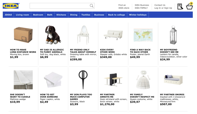
First of all, I think this idea is genius! Agency ‘Åkestam Holst’ in a recent campaign for brand IKEA have renamed their products after frequently googled questions in Sweden.

The campaign called ‘Retail Therapy’ reflects on relationship problems, in their form of a metaphor! While most names are recognisable, others are questionable… and it didn’t take viewers long to post their thoughts.

“My son plays too much computer games”… matched with a pair of scissors? Does that indicate scrapbooking or cutting the console cord… it could be anything.

I find “My friend only talks about himself” quite funny but whats up with “My family doesn’t respect me” driving viewers to a white queen costume! Looks like some kind of Disney Princess theme.  Anyway I think IKEA scored a laugh.

Create a free website or blog at WordPress.com.

Up ↑